
About project
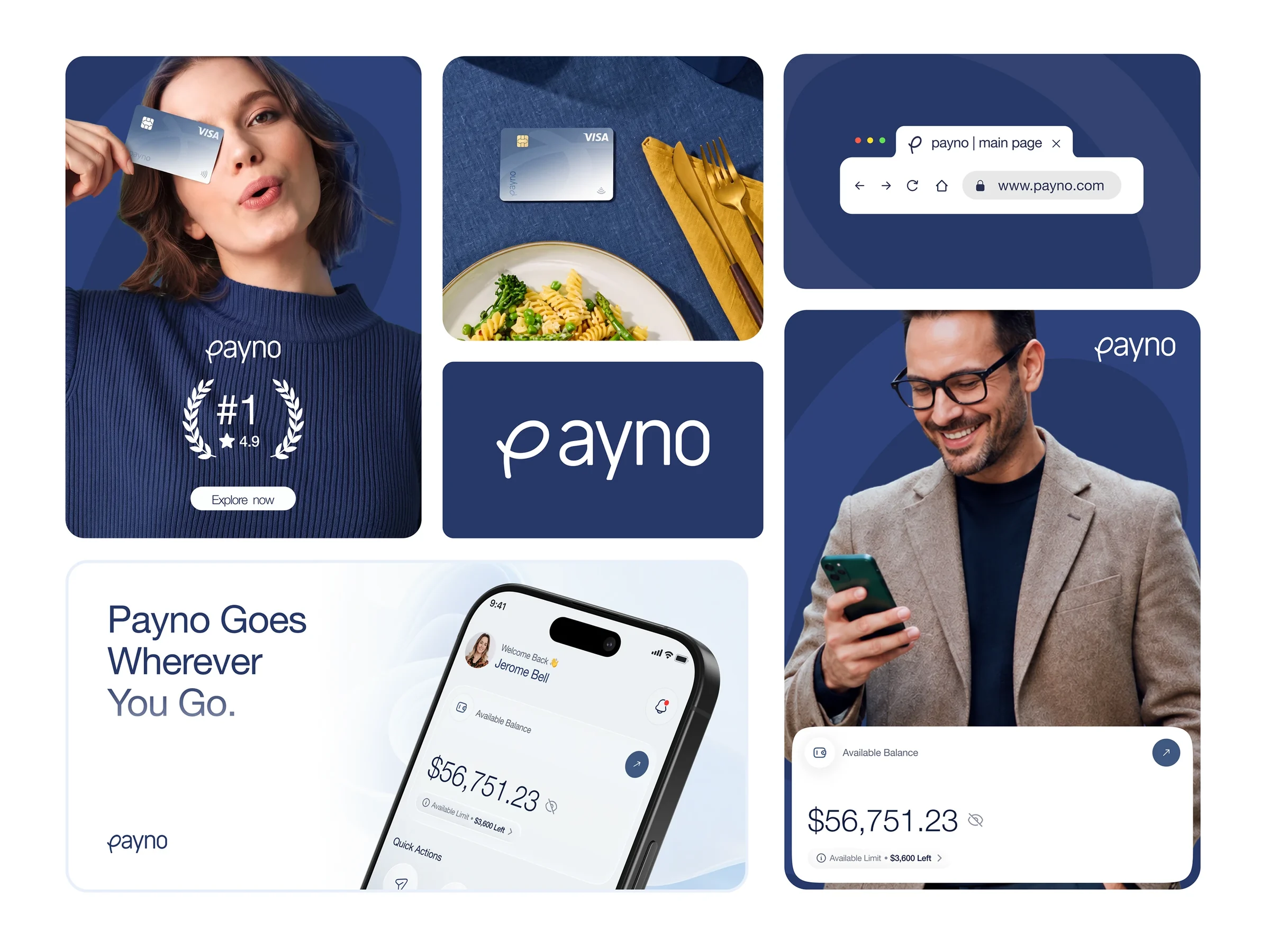
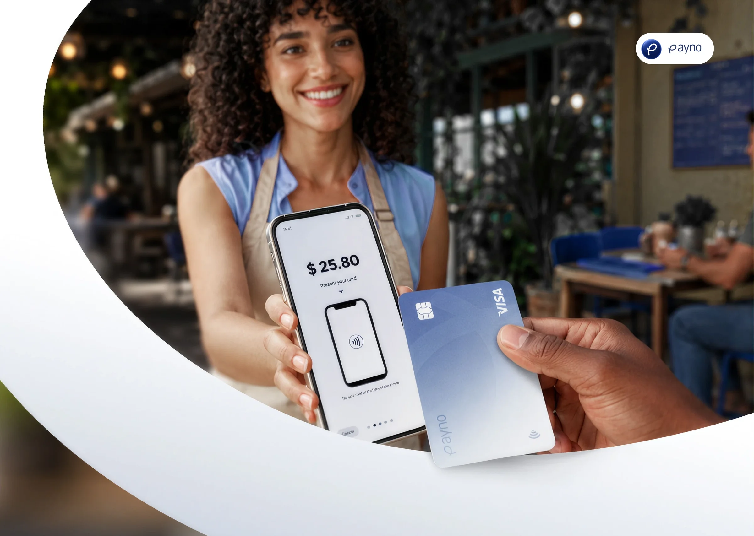
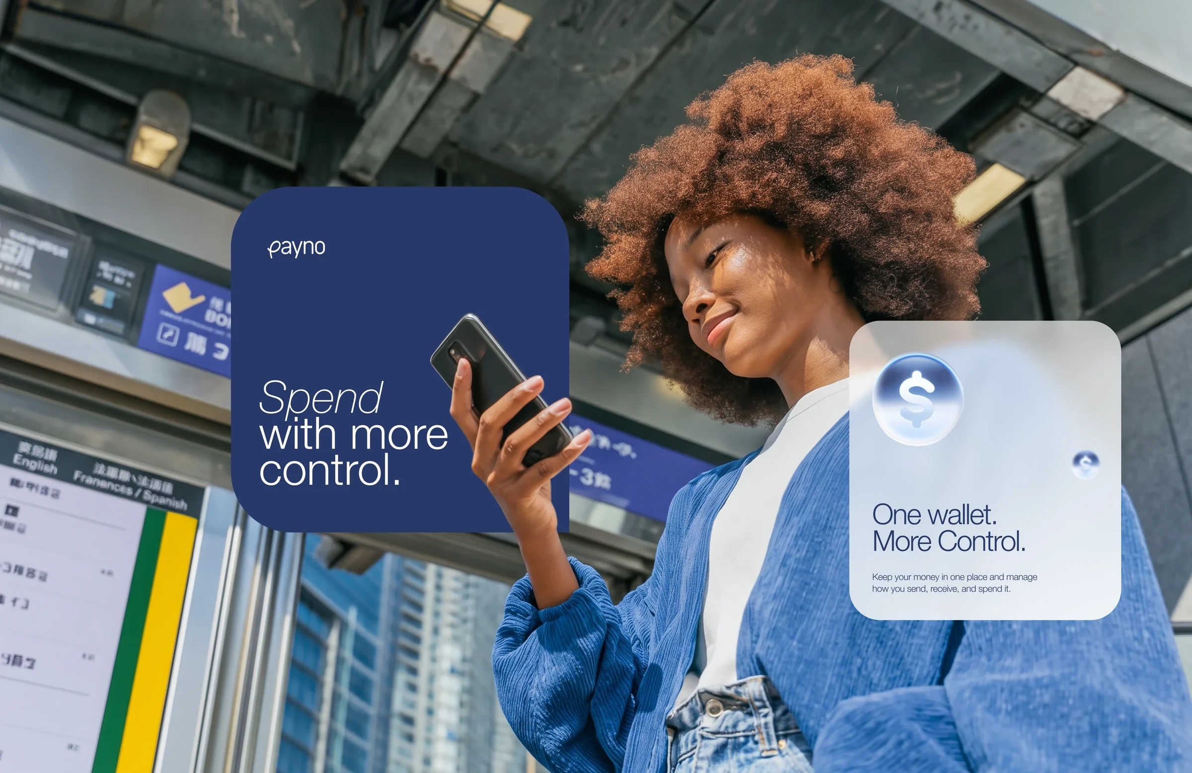
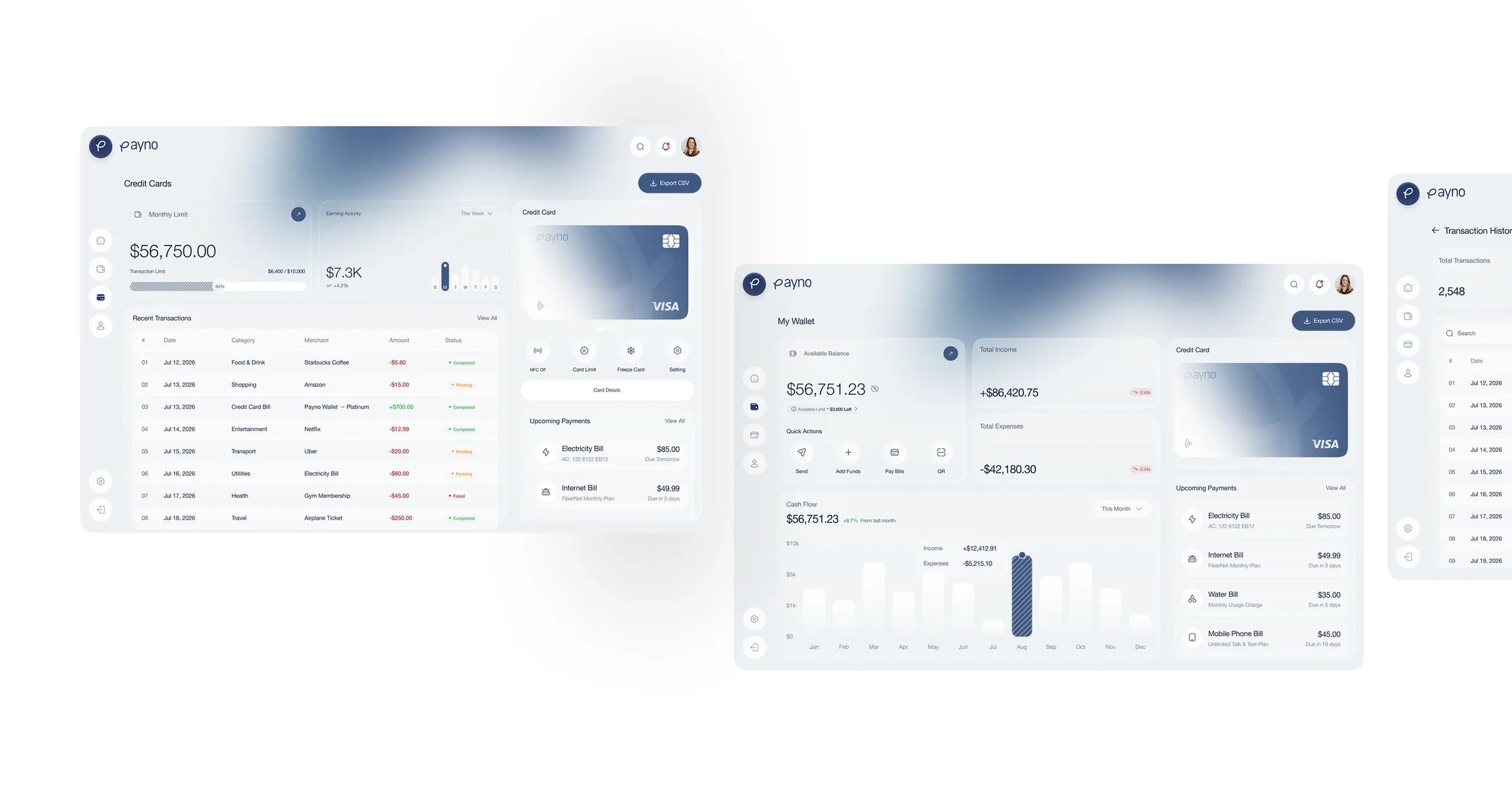
Payno is a smart finance app: one wallet for paying, sending and tracking bills and cards, with a web dashboard for people who want to see everything at once. It had the features of a bank and the look of a spreadsheet. Agencian designed the dashboard and the mobile app around one available balance and four quick actions, drew a hand-written P for the logo, and set the whole brand in one calm navy — from the app icon to posters in the metro.
4.9
2.5
9

How it went
Step #1
Step #2
Step #3
Step #4
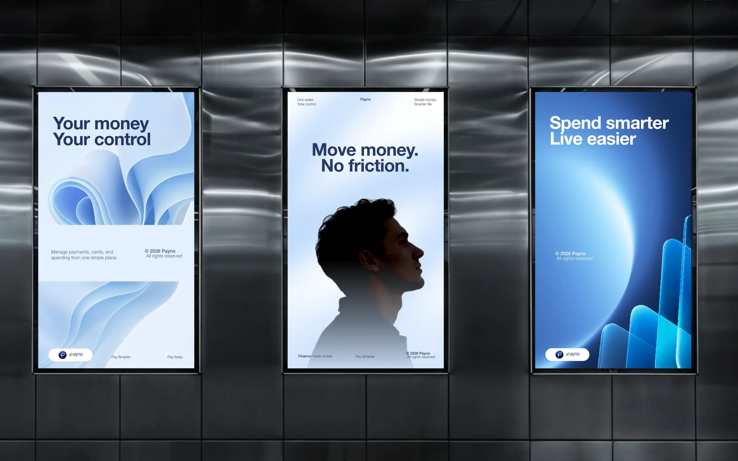
Metro posters: your money, your control
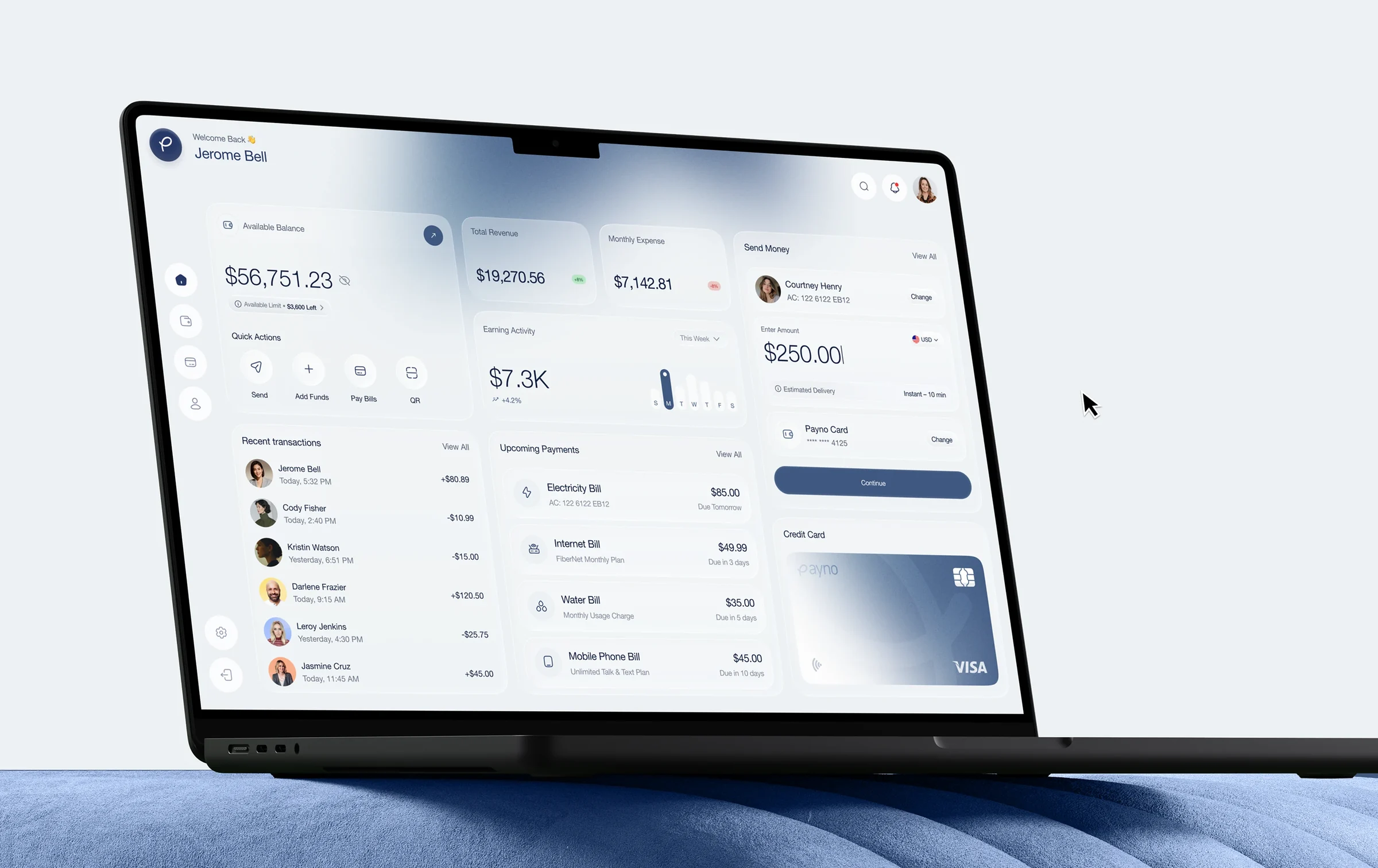
The web dashboard: balance, quick actions, bills
Challenges
A bank’s features, a spreadsheet’s look
Payments, cards, bills and limits were all there — on eight screens with eight different layouts.
Money that felt stressful
People opened the app only when something had already gone wrong.
Web and phone out of step
The dashboard and the mobile app came from different teams and looked like two products.
What changed
4.9
/5
average rating, #1 in its App Store category
2.5
×
weekly active users six months after launch
9
weeks from kickoff to launch
One available balance and four quick actions — send, add funds, pay bills, QR — on every screen.
Upcoming bills appear before they are due, so people open Payno before something goes wrong, not after.
One navy and a hand-drawn P tie the app icon, the Visa card and the metro posters together.








+
You
Tell us where you are and where you want to be. We’ll come back within a day with how we’d get you there.