Rillo gets a lime-bright brand that makes a smart wallet feel simple
Client
Industry
Services
Year
Timeline
About project
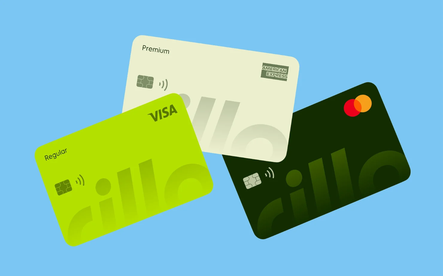
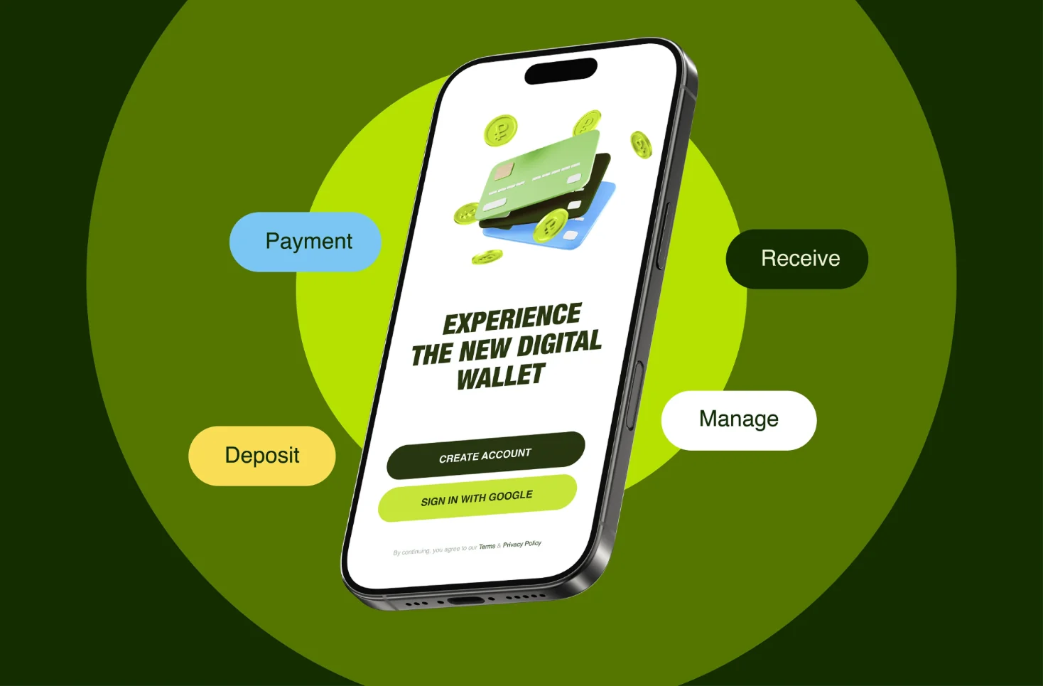
Rillo is an international smart e-wallet: one app to spend, send, save and grow money, with Regular, Premium and Business cards behind it. The product worked, but the brand looked like every other neobank. Agencian built an identity around a lowercase wordmark that stretches across every card, a lime, forest-green and sky-blue palette, and one campaign line — Limitless Spending — that runs from billboards to the App Store.
4.7
2
10
How it went
Step #1
Step #2
Step #3
Step #4

The smarter way to manage your money: the new site
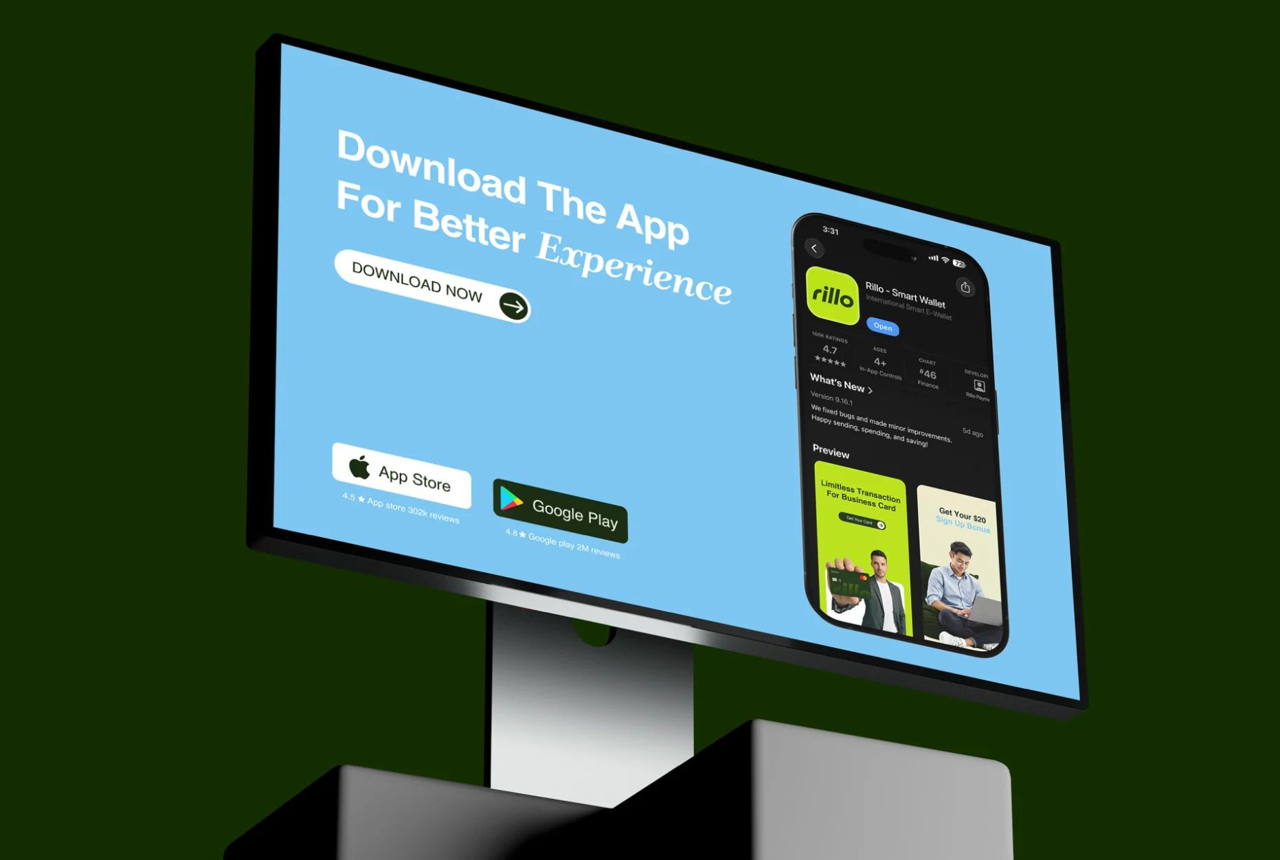
Download page with the App Store listing
Challenges
Another neobank in green
Every wallet app promises simple money; Rillo had to look like it meant it, not like the next fintech template.
Three cards, one brand
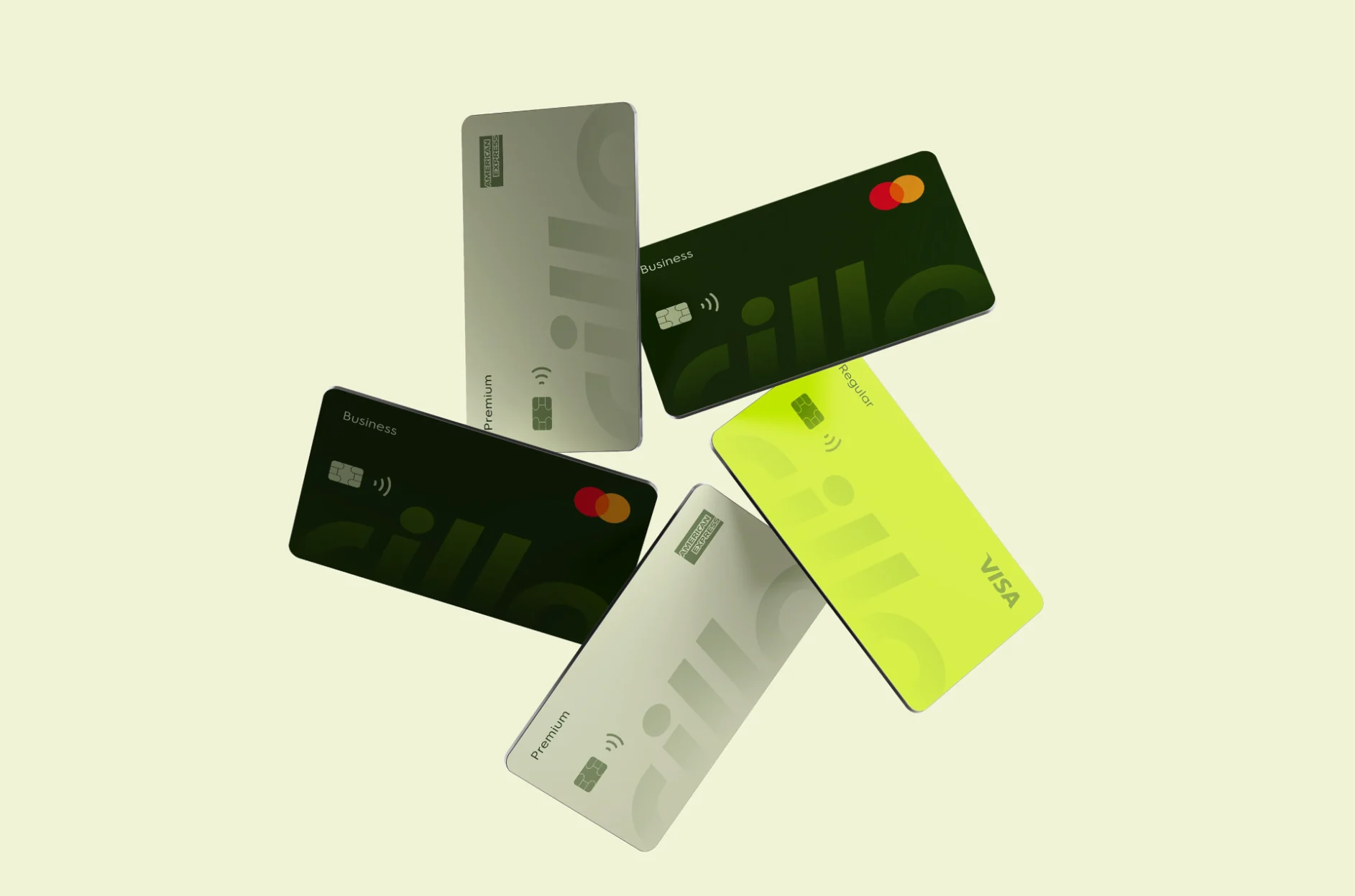
Regular, Premium and Business had to read as one family while still signalling three price points.
From phone to street
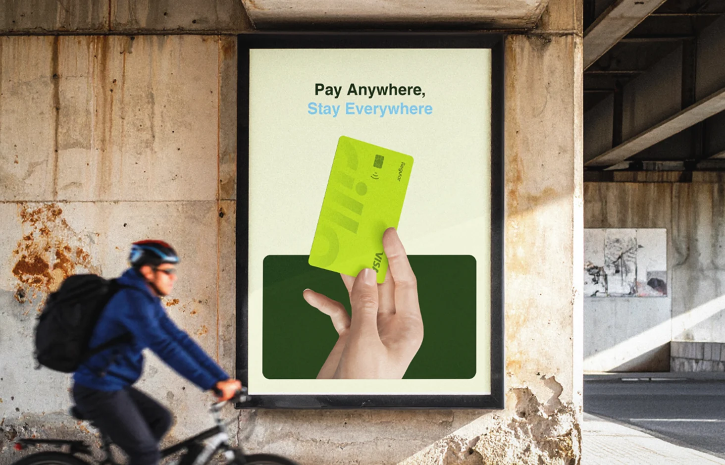
The same idea had to work on a six-inch screen, a Visa card and a forty-foot billboard.

What changed
4.7
/5
App Store rating across 100k ratings
2
M
Google Play reviews, averaging 4.8 stars
10
weeks from kickoff to launch
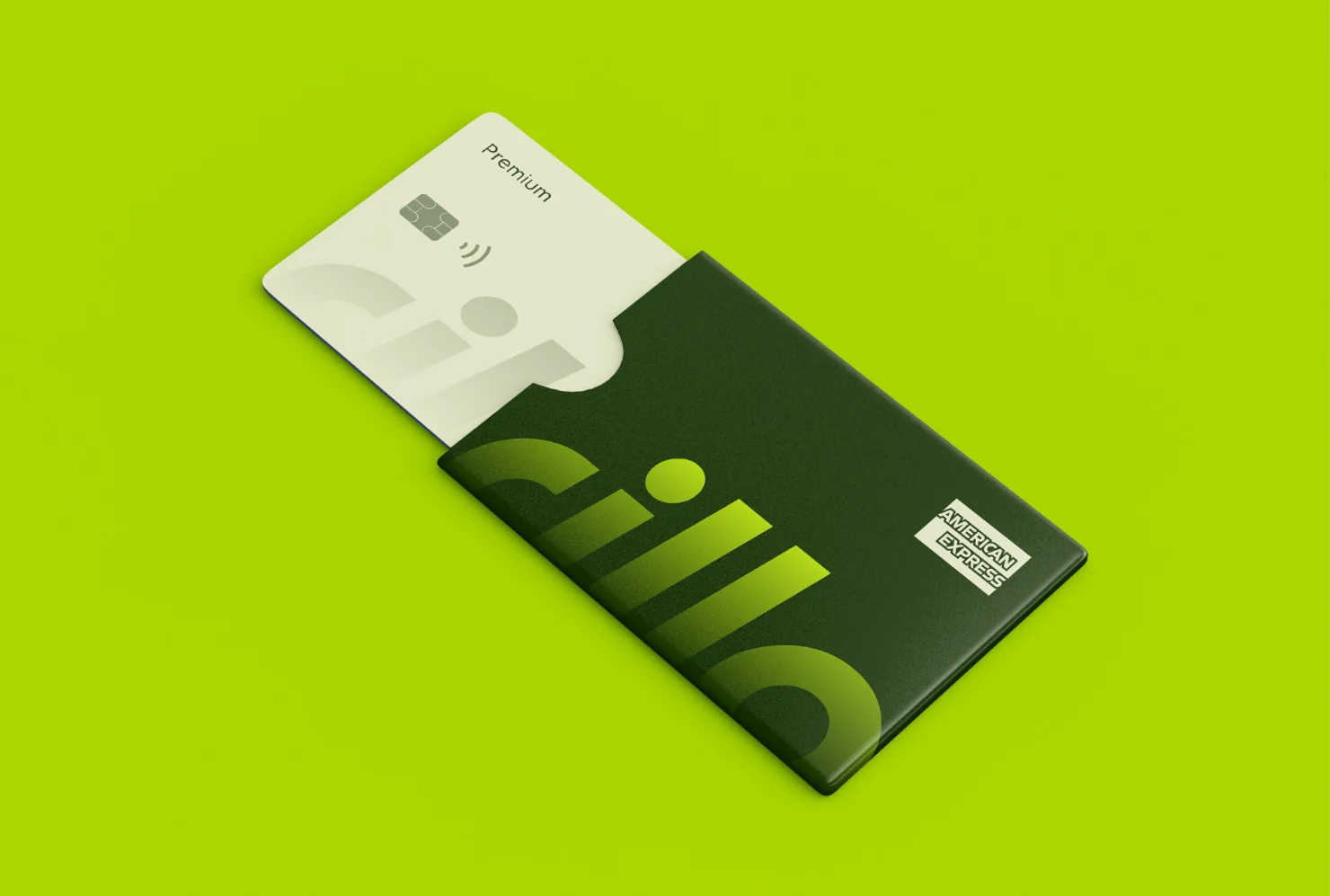
A wordmark whose letters run off the edge of every card, so a Rillo card is recognisable face-down on a table.
Three tiers, three colours — lime Regular, cream Premium, forest Business — from one system.
One line, Limitless Spending, carried from the billboard to the App Store preview.







+
You
Tell us where you are and where you want to be. We’ll come back within a day with how we’d get you there.