A Kyiv marketing studio gets a brand system as clear as the work it sells
Client
Industry
Services
Year
Timeline

About project
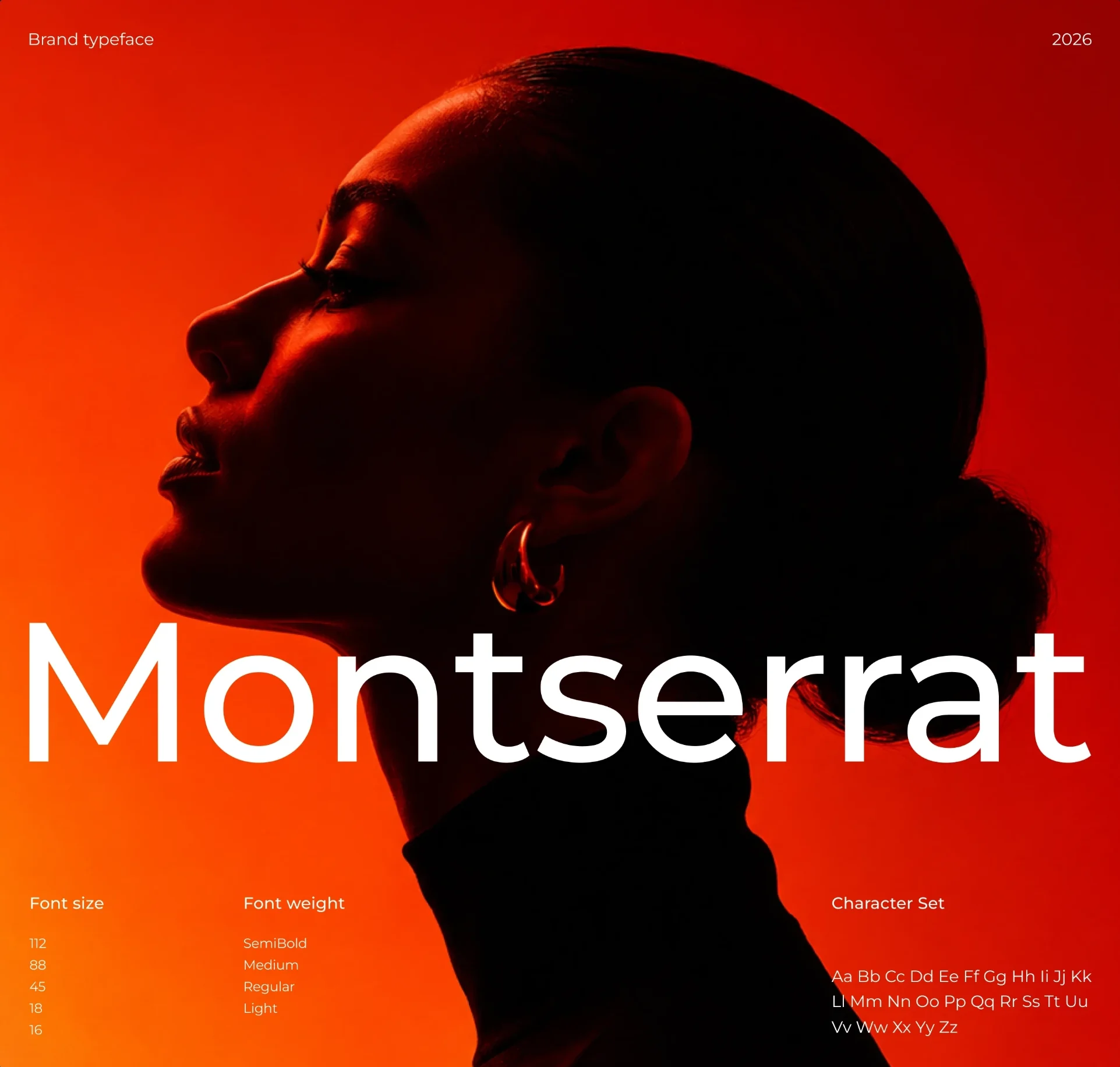
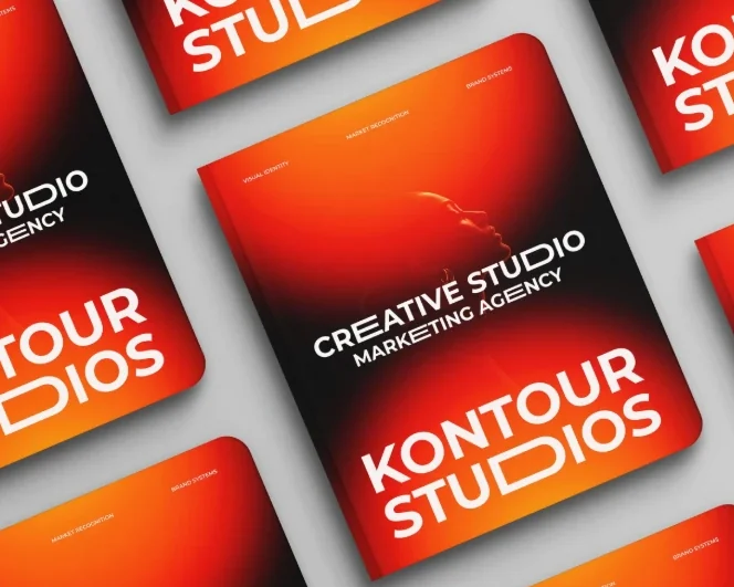
Kontour Studios is a marketing agency in Kyiv that builds brand systems, visual identities and campaigns for its clients — yet its own site, pitch deck and socials each told a different story. Agencian gave the studio a wordmark whose D opens like a bracket, one gradient that runs from Deep Black through Signal Red to Kontour Orange, Montserrat as the only typeface, and a website that leads with a single line: clarity first, then the system.
3.2
58
10

How it went
Step #1
Step #2
Step #3
Step #4
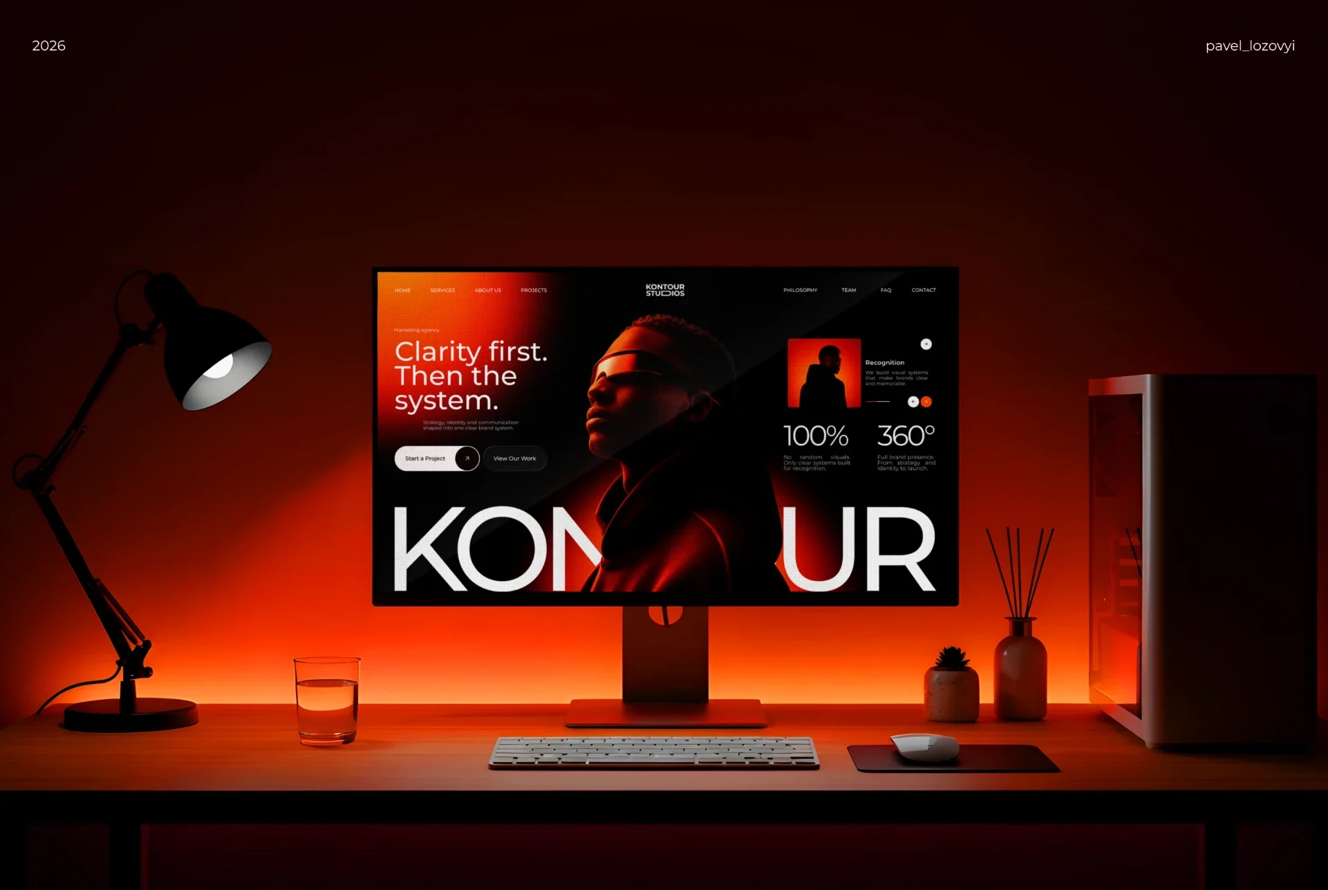
The website: clarity first, then the system
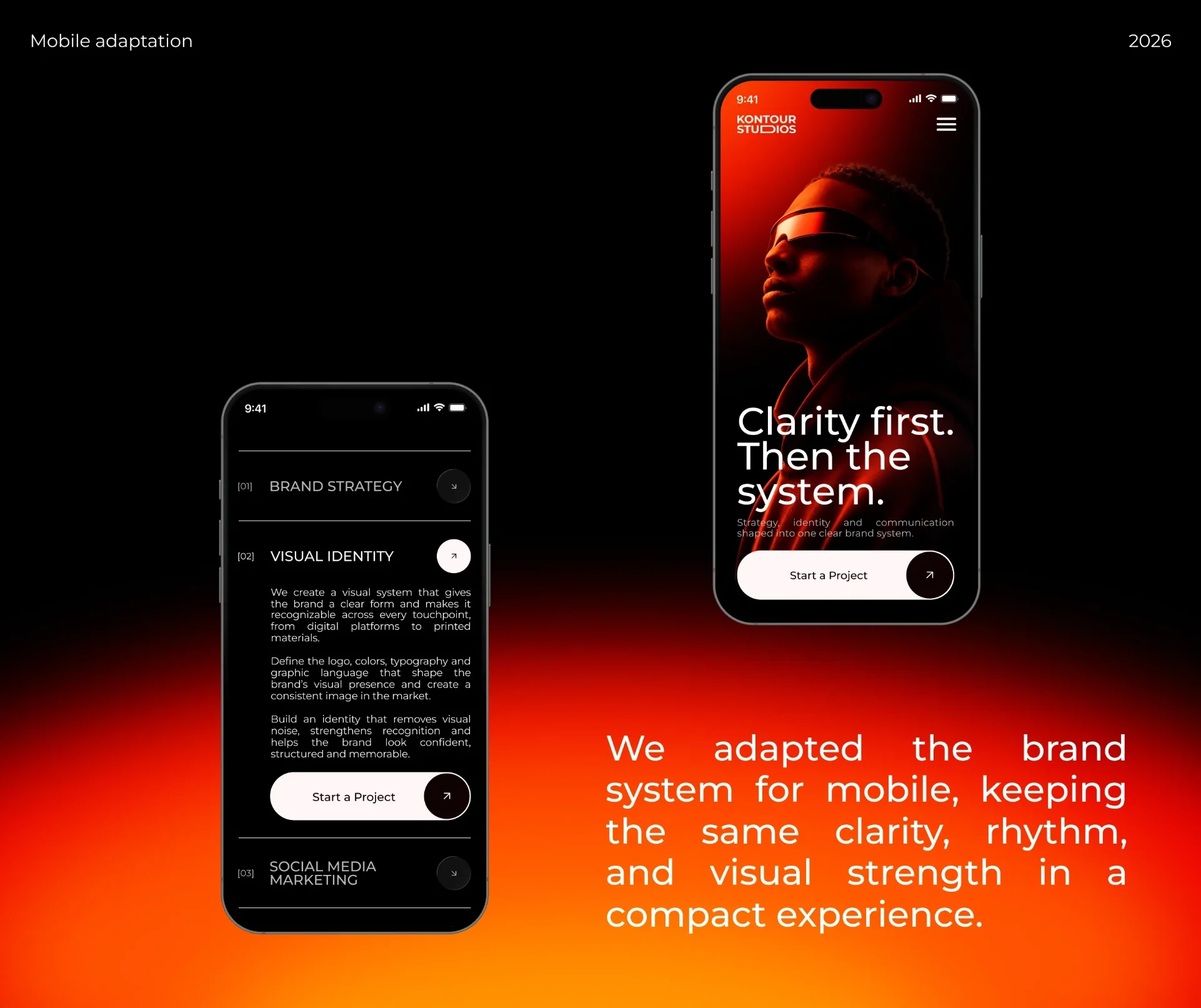
Mobile adaptation: hero and services

Brand stories for Instagram
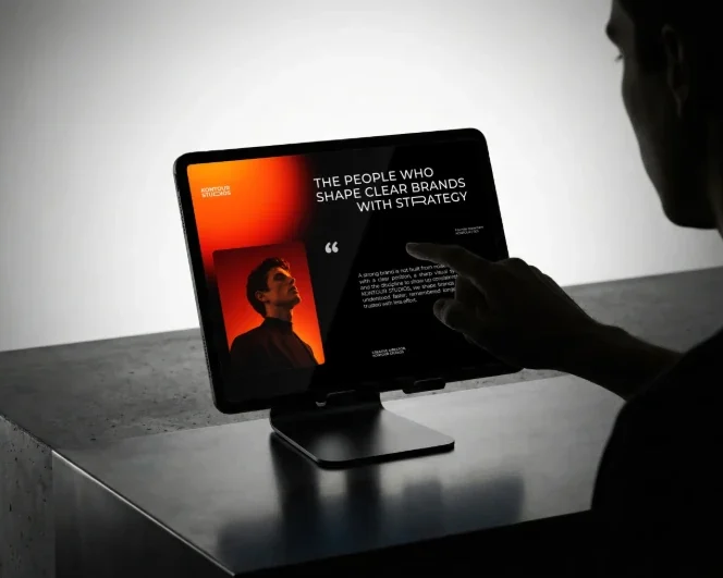
The team page on tablet
Challenges
The cobbler’s children
Kontour built clear brands for its clients while its own site, deck and socials each looked like a different studio.
Loud without the noise
The brand had to hold a 20-metre event screen and still feel calm on a phone in one hand.
One system, many surfaces
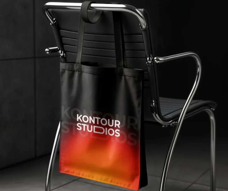
Website, Instagram stories, badges, tote bags and pitch decks all had to read as the same studio at a glance.
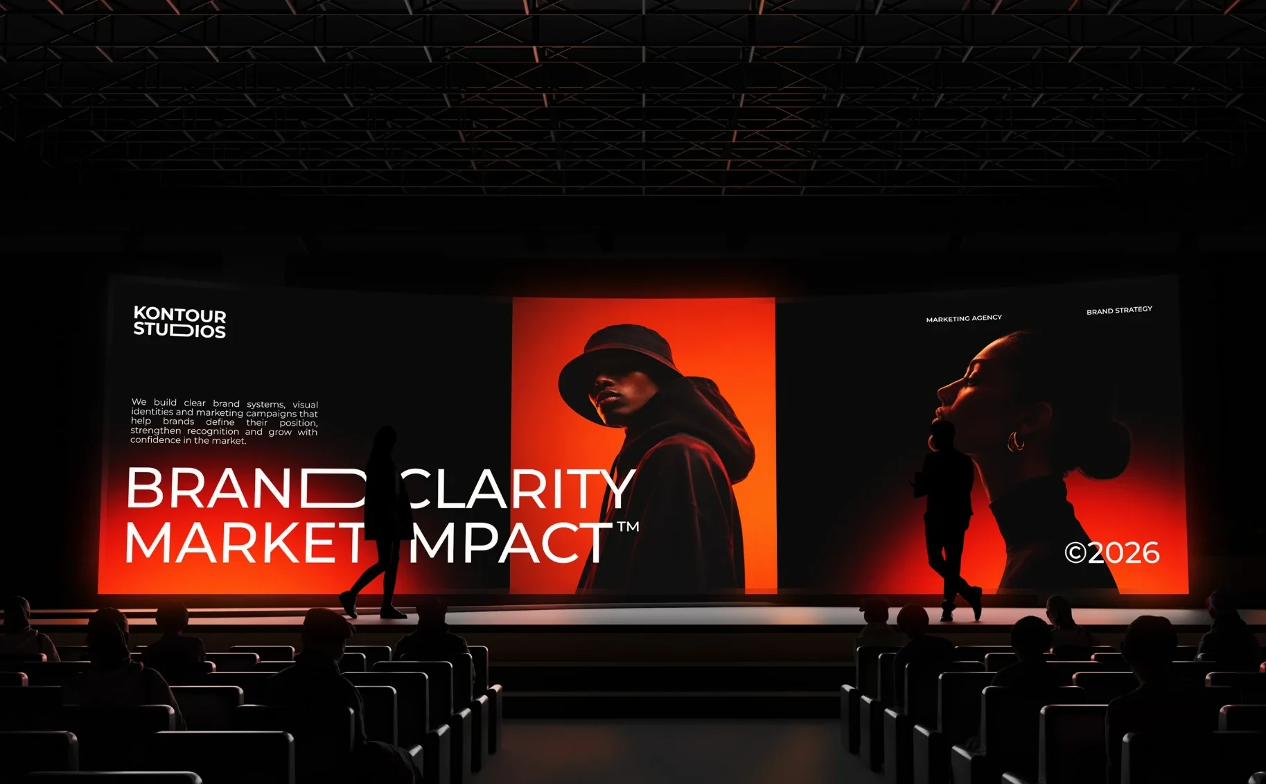
What changed
3.2
×
inbound project enquiries in the first quarter
58
%
more reach on Instagram stories
10
weeks from kickoff to launch
A wordmark whose D opens like a bracket: Kontour frames brands, and now its own name says so.
One gradient from Deep Black through Signal Red to Kontour Orange, so every screen, tote and story is unmistakably Kontour.
Montserrat in four weights and one rule — say it clearly first. The homepage opens with “Clarity first. Then the system.”






+
You
Tell us where you are and where you want to be. We’ll come back within a day with how we’d get you there.